Hey There Delilah
Friday 3 May 2013
Final Ancillary- Hey There Delilah Music Video
Below is our groups final music video for 'Hey There Delilah' by the 'Plain White T's'
Final Ancillary- Digi Pack
Below is my final ancillary task for a digi pack/tray card/cd for the album 'Hey There Delilah' by the 'Plain White T's'


Digi Pack

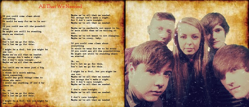


CD:

Final Ancillary- Album Release Advert
Below is my final ancillary of an album release magazine advert, for 'All That We Needed' album by 'Plain White T's'

Album Release Magazine Advert

Thursday 2 May 2013
Evaluation 4) -How Did You Use Media Technology In The Construction, Research, Planning And Evaluation Stages?
Throughout the creation of advance production, I have used a variety of new media technologies in order to make my work of a higher standard. Some of these technologies I have used before in As media some of which however I was very new too. These skills have developed over time which is clear when looking back at As media. My work now looks professional, attractive and individual.
 Prezi was used a few times within my blog as an adventurous way to portray my reseacrh and planning. I used prezi as it gives you the ability to link up your work in a way that then plays as an interactive slideshow.

Dropbox was an effective and easy way to share our work with one another in our group as each person did individual tasks that we would all use. It saved allot of time so that we wasn't back and forth putting things onto usbs. We put many pictures and print screens onto this drop box in which are displayed on our blogs.

Google was our first source of new technology I used in researching 'Plain White T's' and 'Hey There Delilah' aswell as this we used it to research into existing magazine adverts, existing digi packs, band shots and existing logos. Research is a key element to succeeding in this project as I needed to gain inspiration as a starting point to collect ideas.


We immediately started taking our band shots so we could start constructing our ancillary tasks. I used a green screen so that when it came to using the magic wand tool on photo shop I could easily edit it. We also used two lights from left and right and took the pictures with a still camera on a tripod.


Dropbox was an effective and easy way to share our work with one another in our group as each person did individual tasks that we would all use. It saved allot of time so that we wasn't back and forth putting things onto usbs. We put many pictures and print screens onto this drop box in which are displayed on our blogs.

Google was our first source of new technology I used in researching 'Plain White T's' and 'Hey There Delilah' aswell as this we used it to research into existing magazine adverts, existing digi packs, band shots and existing logos. Research is a key element to succeeding in this project as I needed to gain inspiration as a starting point to collect ideas.

Youtube was our key source into choosing our song and band, we searched music videos of the same genre and that of contrasting genres in order to have done a vast amount of research. This research of music videos was also to gain an idea of camera shots/effects, mise en scene, setting, props and the codes and conventions needed. At the end of the project we used youtube as our source of uploading our music videos, pitch, editing and feedback videos.


It was then time to start constructing our ancillary tasks so we uploaded our images onto the computer and immediately started editing them on Photoshop Using the magic wand tool, hue and saturation, brightness and contrast, crop, solid color, rasterize, layer etc. Photoshop was also used to create our band logo as well as the bands name logo. We created the bands logo on photo shop by saving an image of a heart shaped out of roses, it was original pastel pink however I contrasted it to the full and hueand saturated it slightly, which made the roses bright red and very sharp so that the black shadows stood out. I then used the text tool to type the name of our band onto it using our chosen font of Poor Richard.


Our main task was to create a music video. We chose to create a music video to Hey There Delilah by The Plain White t's. We used a hand held camera to film all of our footage in locations such as Bluewater, kierans house, school, and London bridge station. We also came equipped with a jib,dolly, tripod and a tracking system to create movement and levels to our video. We used low key lighting(main spotlight) when filming the band shots in the studio to create a mellow isolated mood. We also used a a hand held camera when taking footage of the creative arts evening premier, feedback, editing process of our music video and evaluation.

Indesign was the software that I used to create my digi pack and album release advert as well as the tray card and cd. Indesign is the best software to use when creating these tasks as they have all the tools you need, cropping, text, enlarging, layering, drop shadow, rotation, masking, opacity etc. All of these are tools that I used within my final ancillary tasks. Indesign was very helpful when creating my tray card and cd as they had borders, measurements and instructions templated onto it for me to follow for my work to look professional. One thing that I learnt on indesign during this project was masking wherein you reduce the opacity of an image so that it sits in the background and still visible, I used this within my work when deciding on what background I wanted to use however I never followed through with this effect.

Premier Pro was the media technology in which we placed and edited our footage onto to create our music video. We had very little experience with this media technology other than our prelim task of creating an open day video. Premier Pro allowed us to place a song onto premier pro and layer the footage over(removing footage sound) it. We cut down all of the footage so that the lip syncing was in time with the music so that it looked realistic. Effects and transitions we used were cross dissolve, zoom, blur, black and white effect and ghosting.
Evaluation 3) -What Have You Learnt From Your Audience Feedback?
Our school held a creative arts evening to showcase our success in all arts suhjects through textiles, art, dance, drama and media. We felt that this was a great opportunity to premier our music videos to a large audience so we can gain some audience feedback:
Below is the introduction video:
Hey There Delilah At The Creative Arts Evening
Audience Feedback 1
Audience Feedback 2
Audience Feedback 3
Audience Feedback 4
Narrative: It was clear through feedback from audience members that the narrative was capturing and in a sense reception theory worked well for there favourite element was the genre of romance. They were lured in by the strength of there love and wanted to feel the same love as they do. It was mentioned many times that they liked the romantic shots of holding hands, hugging and romantic walks, this shows that the genre was portrayed well. They understood that the narrative was about separation and the audience said that they were moved by this and the use of black and white, created a mellow mood for not only the narrative but for the audience, this shows that we were successful in bringing out emotion through acting and the story line. The setting of the lake was mentioned by an audience member as they felt it was romantic, and the trees and sun in the background helped to bring out a happy mood when they are together, an example of pathetic fallacy.
Mise En Scene: Audience feedback showed that mise en scene helped to represent the band member as an indie pop rock artist, through the beanie he was wearing and casual shirt buttoned to the top to create the casual smart look. Also the use of skinny jeans helped to reflect this genre as it is what is stereotyped. Because the mise en scene reflected the genre the audience mentioned that it helped them to get a feel of their personality and style of music. An audience member noticed how the guitar was the only instrument used, they mentioned how it made the video more soft and romantic as it reflected the indie pop rock genre but it is also a stereotyped romantic gesture to sing and play the guitar to someone. An audience member also mentioned how there was a red motif throughout the music video, they said that the red motif clearly helped to represent the genre of love and give a warm vibe to the music video.

Camera Shots: Abstract camera shots were frequently mentioned by audience members, they said it helped to break up the band shots to the narrative so that there was more of a mixture. They realized how they all symbolized something, like the duck swimming away was just like Delilah leaving and the bee looking for food was like Tom looking for Delilah. It was mentioned how the sun effectively shone through the trees creating a glare on the camera. The train shots wherein my face reflected in window was said to have been very effective as it helped to portray my sad emotion and effectively the trees in the background shone through as well which made an effective zoom in. The audience mentioned how having happy shots in colour and sad shots in black and white helped to differentiate the emotions I was feeling but also made our music video individual from everyone. Lastly an audience member commented on the band filming and how the movement of the camera made them move with it, they particularly liked the close up on the fingers playing the guitar.

Evaluation 2) -How Effective Is The Combination Of The Main Product And Ancillary Texts?
I created an album release advert, a digi pack and a music video, all in which shared the same conventions for it to come together as one promotional package.I wanted the audience to be able to look at each of my tasks and be able to relate them to the same band through the genre, style, typeface, logo etc all of which are small yet vital elements which identify them as one.

Codes and Conventions that were followed throughout my ancillary tasks are:
- Typeface for band name,advertisement and album name-poor richard
- Typeface for lyrics/advertisement- prestige
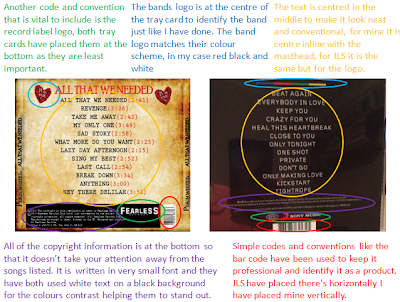
- Fearless Records Logo
- Barcode
- Effects on images
- Using the same people
- Background
- Colour scheme-black,red,white,brown
- Band logo
- Rose
It is clear that my ancillary tasks are linked and related to our music video as we have included:
- Same Actors
- Same Guitar
- Red motif
- Black and white effect
- Mise en scene
- Paper shots
- Serious and happy shots
- Band Name
Here the same guitar has been used within both tasks to show that they are part of the same package and to reflect the genre of indie pop.The guitar in the digi pack however is a different colour as it has been edited.

Here we have used the same actors in the band shots for the digi pack and album release poster as we have in the music video. We did this so that the main band member also played the main character in the narrative and the only girl in the band played the main girl in the narrative therefore it all links up.

Here we have followed the black, red, white and brown colour scheme. We have also followed through the use of a red motif, in the video the pen is the motif and on the digi pack the bands logo is the red motif. Here you can also see that the same band name has been used, simple yet identifies them as one.

Here you can see on our digi packs that we have used a worn out paper as our background, within our music video we have shots of lyric writing on paper this is just like the lyrics being displayed onto the worn out paper on our digi pack,

Here we have used a variety of shots portraying different emotions. Within our digi pack we posed with serious and happy faces to portray our characters and give it a slightly warm vibe. Within our music video we have happy shots when Delilah and Tom are together and sad shots when they are departed.

Uses and gratification theory is portrayed throughout our ancillary tasks, within the narrative escapism is shown by emphasizing the journey between the two characters to the point where the audience see it as reality as they are so drawn in and become the character themselves. The audience may escape into new emotions and situations just through watching and listening to the song.
Personal relationships are applied within the narrative through footage such as flashbacks, chemistry between the characters (hugging, kissing, smiling,holding hands) and locations. This is also appliedwithin our ancillarys through the song lyrics, red colour scheme and the red heart of roses as the logo. For the smallest thing could create emotion for the audience member as they could be reminded of a specific time in their life.
Personal identity is shown throughout our ancillary tasks and the main task of creating a music video as the genre is indie pop therefore attracting two different social groups. The age of the band members, actors are perceived as 19-21s, luring in an audience possibly 15+. The theme of love and romance is what implies this target audience as teenagers become emotionally involved and attached in relationships creating personal identity.There are both male and female band members which means both sex audiences could relate to our music video.
Evaluation 1) -In What Way Does Your Media Product Use, Develop Or Challenge Forms And Conventions Of Real Media Products?
The development, planning and research process is what gave me an insight into the codes and conventions of what is needed in a digi pack, album release poster and a music video. These codes and conventions are what makes a media product become professional and effective. For example when it comes to an album release poster, if there's no masthead, band logo or key image, it wouldn't catch an audiences attention because they wont't be able to identify who the band are and what the poster is trying to get across to the audience. Through research I took into consideration the vital codes and conventions needed and adapted and translated them into my work so it becomes professional and individual. Within this blog post I will analyse the ways in which my media product has used, developed and/or challenged forms and conventions of real media products.
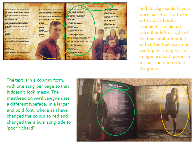
I have compared the codes and conventions used in my digi pack ancillary task to existing digi packs:


I have compared my main task to existing music videos:
Here we have used this finishing shot of the stool alone in a vast isolated area.Within this shot the stool resembles Tom being so alone. The use of a vast surrounding is effective as he still feels so alone. Both shots have dim low key lighting to create a mellow mood, the main spotlight in both shots helps to create the reflection of the stool.


Ben Howards 'keep your head up' displays a shot of the sun catching the camera creating a piercing glare, this effectively took place in our video. This sun reflects the happy mood of the characters as they are together, this is an example of pathetic fallacy through camera shots.

This is a camera shot from Two Door Cinema Club's music video to 'Handshake.' Our music video has included many close ups of the guitar strings being plucked. This is an example of a different angle shot, filming down the spine of the guitar so you can really feel like you're in the music.The use of their faces being cut off means that the music speaks for itself, the zoom on the fingers playing the guitar portrays mystery.


Taylor Swifts 'We Are Never Getting Back Together' displays a shot behind the actors following them, Taylor is walking through a love heart and me and Kieran are walking through a tunnel, both of witch are romantic settings. From the back of the actors you can see the chemistry through holding hands, hugging and play fighting. Effectively there is light at the end of our tunnel which shows that there is hope, in Taylors video there is an ongoing forest showing that they will forever be on a journey with each other.

I have also compared the codes and conventions used within my album release magazine advert to an existing advert:

I have compared the codes and conventions used in my digi pack ancillary task to existing digi packs:
Front Cover

Tray Card

Interior
I have compared my main task to existing music videos:
Here we have used this finishing shot of the stool alone in a vast isolated area.Within this shot the stool resembles Tom being so alone. The use of a vast surrounding is effective as he still feels so alone. Both shots have dim low key lighting to create a mellow mood, the main spotlight in both shots helps to create the reflection of the stool.

Ed Sheerans 'A Team' uses a black and white effect throughout the whole of his music video. I have incorporated this into my music video in scenes wherein we are upset and departed from one another. The black and white creates a sad effect and brings out emotion in the audience.

Ben Howards 'keep your head up' displays a shot of the sun catching the camera creating a piercing glare, this effectively took place in our video. This sun reflects the happy mood of the characters as they are together, this is an example of pathetic fallacy through camera shots.

This is a camera shot from Two Door Cinema Club's music video to 'Handshake.' Our music video has included many close ups of the guitar strings being plucked. This is an example of a different angle shot, filming down the spine of the guitar so you can really feel like you're in the music.The use of their faces being cut off means that the music speaks for itself, the zoom on the fingers playing the guitar portrays mystery.

This is an example of a birds eye view look of a city from Adeles 'Make You Feel My Love', ours is the view of London. The use of this shot shows how big the world is yet how alone you can still feel.This shot also creates iconography for the audience for it is the view from the shard. The lighting within this picture is very glum and moody which reflects the emotions of both the characters. The use of this Birdseye view shows how they are both out there somewhere in the big world but can't be with each other.

Taylor Swifts 'We Are Never Getting Back Together' displays a shot behind the actors following them, Taylor is walking through a love heart and me and Kieran are walking through a tunnel, both of witch are romantic settings. From the back of the actors you can see the chemistry through holding hands, hugging and play fighting. Effectively there is light at the end of our tunnel which shows that there is hope, in Taylors video there is an ongoing forest showing that they will forever be on a journey with each other.

I have also compared the codes and conventions used within my album release magazine advert to an existing advert:

Subscribe to:
Posts (Atom)